It is no surprise to regular readers that we have harped on in recent months in light of the US Immigration Reform bill now which has passed the Senate (albeit stalled in the House of Representatives) about the ills of the Immigration system, the state of Immigration today, general statistical trends as well as comparisons to other countries and how much this is hurting the US economy at large.
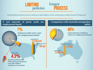
Well we recently came across a great infographic comparing US and Australian immigration and the access to Permanent Residency that crystalizes simply the problem that exists today. Both countries are modern western countries with high standards of living, high level GDP per capita and huge diversity in the populace due to the founding and growth of the respective countries fueled by global immigration.
However there are a couple of major differences. While proportionally Australia has a higher foreign born and immigrant population it is only a nation of 23 million vs. 315 million in the US. Despite that the amount of Permanent Residency approvals (often called Green Cards in the US) for employment based or skilled based reasons is almost the same annually. Australia has about 129,000 vs. the US having 140,000.
(courtesy Tatiana Galzy – Fi2W is featuring stories by students in the Feet in 2 Worlds journalism course at The New School)
The major reason for this disparity is the fact Australia issues 40% of all Permanent Residents for skilled employment reasons thus having a net positive to the economy. However the US only issues 7% of all Green Cards for the same group and only 4.3% are the cream of the crop high skilled or vastly experienced professionals.
Why is this a problem?
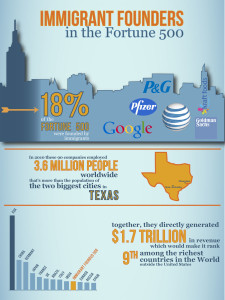
Well to keep with the simplicity of the article, we present a last image to leave you with. If the Top 500 Immigrant founded US companies (an Immigrant Fortune 500 if you will) were an economy unto themselves, they would be the 9th largest economy in the world. And that is only from direct economic benefit not counting indirect benefit such as the flow on effect to other industries and companies as well as what their combined 3.6 million employees further do with their salaries. To put that into perspective that is bigger than the economies of Russia or Canada as a whole at 1.7 Trillion USD.
(courtesy Tatiana Galzy)
So the next time someone has an argument with you about US Immigration policy and wanting it to be more conservative and your reasoned verbal and written arguments don’t work, it may be these 2 simple charts that paint the best and clearest picture.
Cj

